
Design Systems - Management + Migration
UI Design
rolling updates
Previously only utilizing Sketch, Urban Outfitters and our family brands where met with the directive of implementing Figma across the URBN enterprise. Doing so would allow our site and app styles to be shared transparently between the UO brand team and our white label team at URBN. On a more granular level it also presented the opportunity to create a new component library within our internal design system - a feature unique to the Figma platform - which would allow us to implement updates globally across our design files. Page elements, color and text libraries would now align names with their codebase counterpart, enabling seamless language amongst developers and designers.
Building A Library
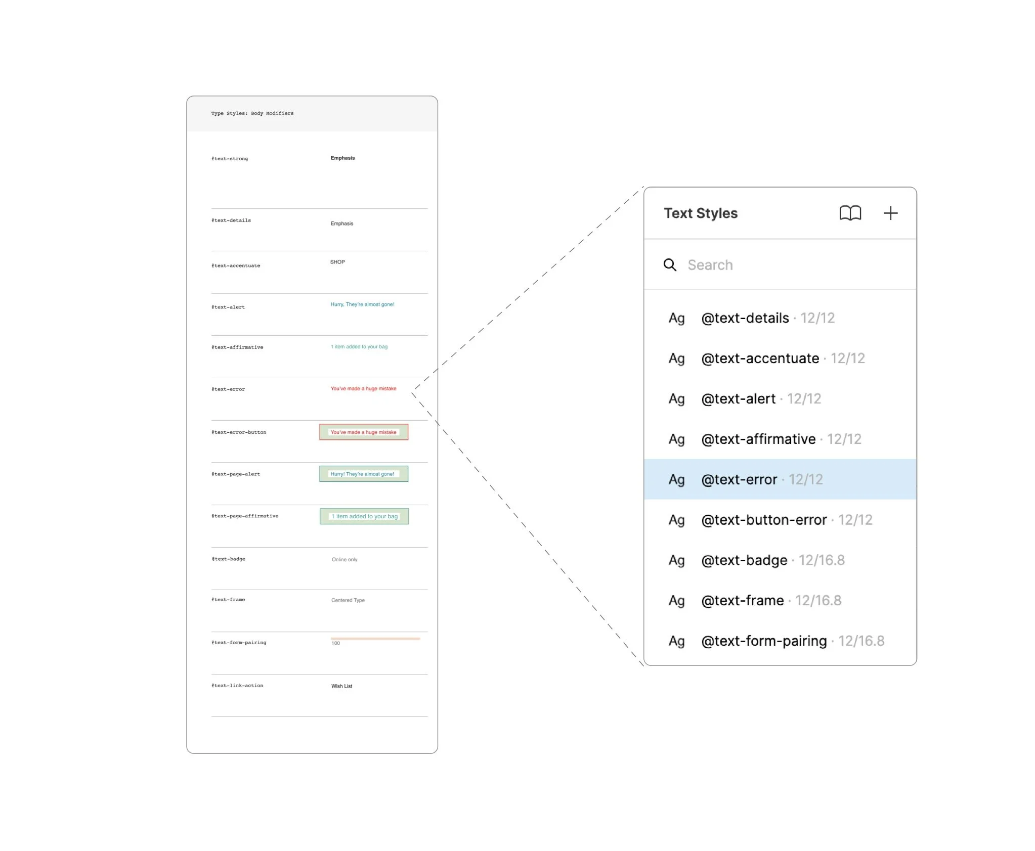
With the opportunity to build a completely new library we focused attention on naming conventions allowing our codebase to dictate both App and Web styles for color and text across UO while remaining inline with our white label styles hosted on Jira.
Creating Live Global Components
A global component library not only gave us the opportunity to make visual updates as needed but to also create live prototypical elements living directly on high fidelity mockups.
Simple & Complex Interactions
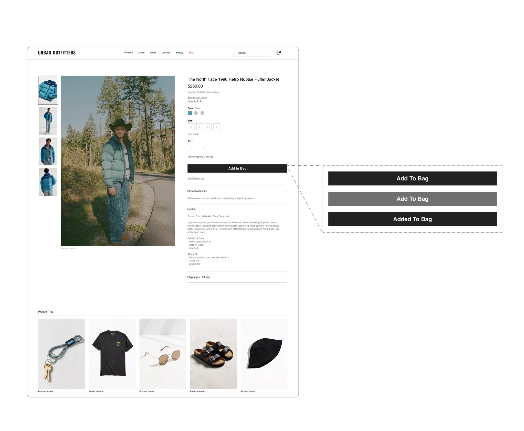
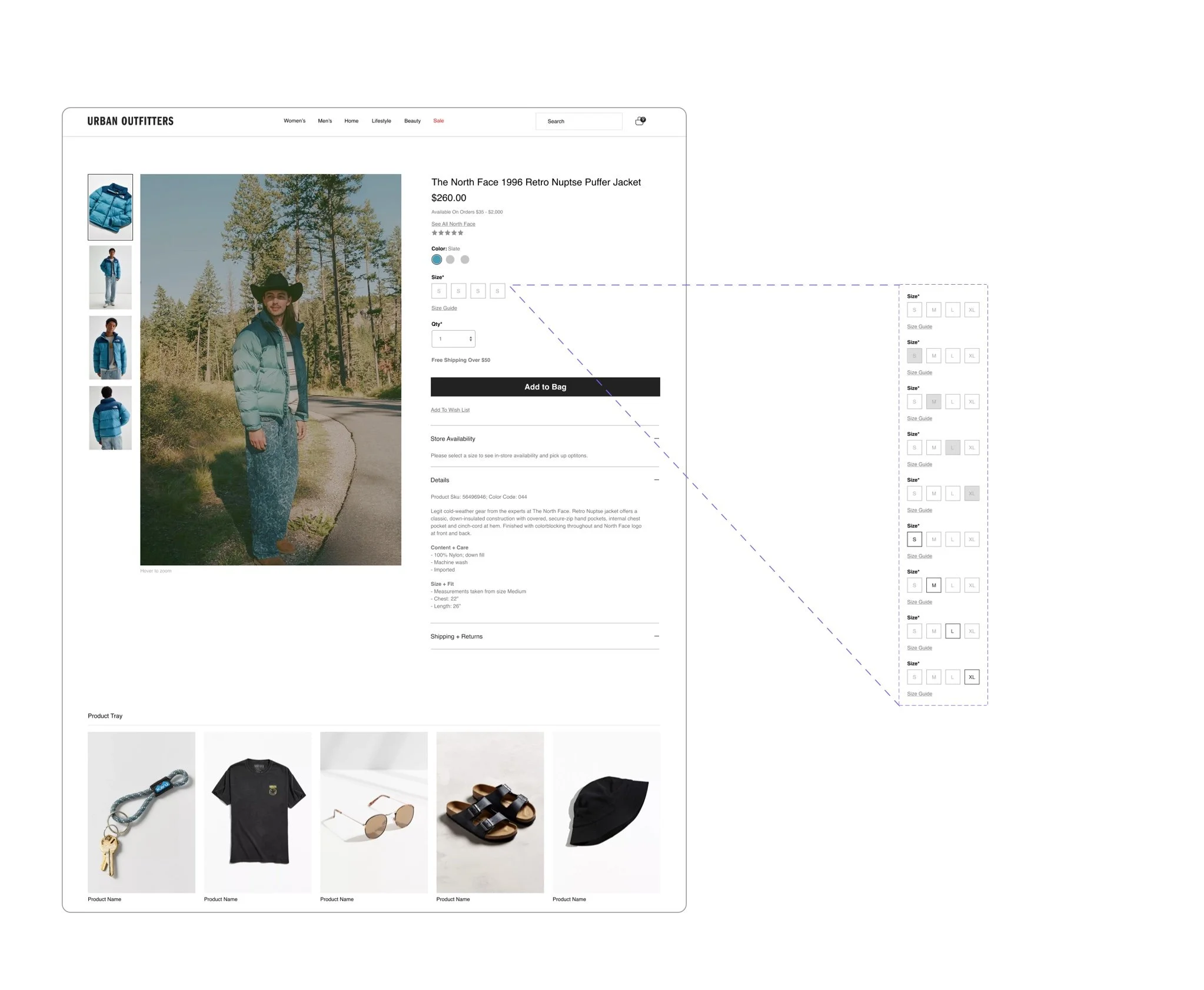
with 30 + live components living across the UO web experience complexity varied on each, inviting our team to look at all possible use cases and user outcomes within a given element. Shown to the left are the Add To Bag CTA - with three states and our Size Selection module with nine interactions each linking to over 60 possible outcomes.
Outlook
Once migration is complete Urban Outfitters along with our family of brands will utilize Figma across the workflow. Allowing us to share designs and ideas seamlessly while keeping within our individual brand experiences.